Case Study
Naissance Sacrée / Sacred Birthing
I collaborated with Naissance Sacrée / Sacred Birthing, a holistic doula and birth mentorship practice, to create a cohesive visual identity and bilingual WordPress website. Combining logo design, thoughtful typography, soft colours, and natural imagery, the project delivers a warm, intuitive digital experience that reflects the client's philosophy and connects visitors with her services and educational resources.
Project
Client Background
Naissance Sacrée / Sacred Birthing is a holistic doula and birth mentorship practice offering compassionate support throughout pregnancy, birth, and early parenthood.
The client wanted a bilingual English and French website that communicated her philosophy of accompanying birth with gentleness, vibrational wisdom, and sacred love.
The challenge was to translate these deeply personal and spiritual values into a cohesive visual identity and digital experience that felt welcoming, trustworthy, and professional.
Project Goals
- Develop a gentle, recognizable visual identity reflecting the client’s holistic approach to birth and motherhood.
- Create a bilingual WordPress website accessible to English- and French-speaking audiences.
- Establish a cohesive design system through colour, typography, photography, and visual elements.
- Design a responsive website that encourages visitors to explore the client’s philosophy, services, and educational content.
- Integrate clear navigation, contact opportunities, and external booking functionality.
- Provide a manageable website foundation for future content and service expansion.
Scope of Work
The project involved:
- Logo design and visual identity exploration.
- Primary logo and supporting variations for English and French applications.
- Colour palette and typography selection.
- WordPress website design and development using an existing theme.
- Bilingual website configuration using Polylang.
- Responsive page layouts for desktop, tablet, and mobile.
- Content integration, imagery selection, and visual hierarchy.
- Blog and educational content layouts.
- Contact forms and external booking integration.
- Basic on-page SEO, image optimization, and website testing.
Design Direction
The creative direction was inspired by the concepts of birth, transformation, femininity, and connection.
The goal was to balance the spiritual nature of the practice with a refined, approachable visual language.
The design incorporates:
- Organic imagery: Pregnancy, motherhood, water, flowers, and natural environments.
- Soft colour palettes: Muted rose, warm neutrals, and subtle gold accents.
- Elegant typography: Expressive serif headings paired with restrained supporting typography.
- Symbolic elements: Delicate illustrations and motifs referencing feminine energy, nature, and transformation.
These elements create a calm, intimate atmosphere while maintaining a clear and consistent visual hierarchy.
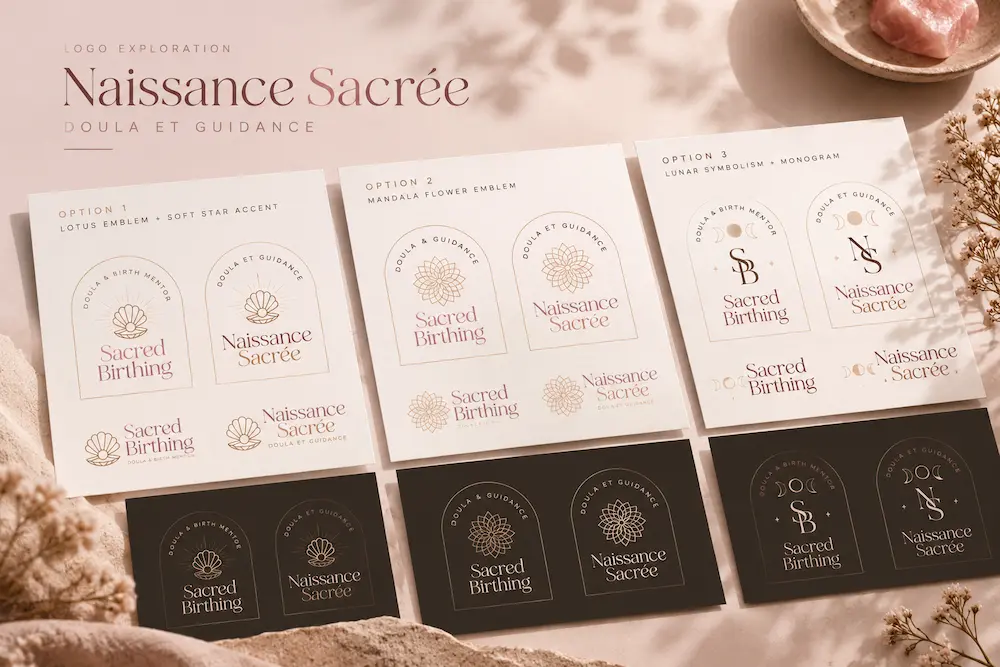
Brand Identity & Logo Exploration
The branding process explored several visual directions inspired by sacred femininity, natural cycles, and the transformative experience of birth.
Concept development included organic floral forms, celestial symbolism, and abstract geometric elements.
Each direction considered how the identity would translate across English and French applications, digital platforms, and smaller-scale uses.
The final visual direction emphasizes softness, elegance, and a sense of personal connection.
Logo System
The identity exploration included:
- Primary wordmarks for Naissance Sacrée and Sacred Birthing.
- Stacked and horizontal logo arrangements.
- Symbol-based emblems and supporting marks.
- Light and dark colour variations.
The logo concepts were developed to maintain a cohesive visual language across both languages while allowing flexibility for different applications.
Colour Palette & Typography
The visual palette draws from natural, feminine tones to create a sense of warmth and reassurance.
Muted pinks and dusty rose tones introduce softness, while warm neutrals and delicate gold accents provide balance and refinement.
Subtle contrasting accents help distinguish interactive elements and guide visitors through the website.
Typography combines elegant serif lettering with supporting text styles, creating an editorial aesthetic that complements the intimate subject matter.
The overall visual system was designed to feel calm, thoughtful, and expressive without overwhelming the content.
Web Design & Development
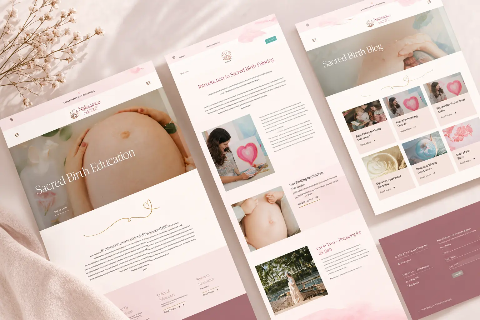
The website was designed around the client’s storytelling and educational content, with an emphasis on readability, imagery, and intuitive navigation.
Responsive Design
Layouts were adapted across desktop and mobile devices, maintaining consistent typography, spacing, and visual hierarchy.
Bilingual Experience
English and French content was integrated using Polylang, providing a consistent experience across both language versions.
Content Architecture
The website organizes information into distinct areas for the client’s philosophy, birth education, sacred painting, blog content, and contact opportunities.
Visual Storytelling
Large photographic sections, alternating image-and-text layouts, and generous whitespace establish a natural reading flow.
WordPress Development
The site was built on WordPress using a purchased theme to provide a flexible content management system that the client could maintain and expand over time.
Design Outcome
The project brought together brand identity design and web development to establish a cohesive digital presence for Naissance Sacrée / Sacred Birthing.
The completed work includes:
- A visual identity informed by the client’s philosophy and values.
- A responsive, bilingual WordPress website.
- Consistent typography, imagery, and colour treatments across the site.
- Structured layouts for services, educational resources, and editorial content.
- A flexible platform supporting future content and business growth.
The result is a gentle, visually expressive digital experience designed to help visitors feel welcomed, informed, and connected to the practice.
Credits
Brand Identity, Web Design & Development: Riley I Design
Brand Photography: Jacey Kendall Photography